The Ouroboros: the inspiration for our logo:
How does a generalist, non-Western art gallery create a logo that embodies the qualities of the multitude of historical cultures we represent?
This is a hard assignment. A Greek capital would be too western, a Maya pyramid would resonate with pre-Columbian art fans and Asian forms are distinctly Eastern.
This daunting task was assigned to a brilliant MFA artist and designer, Leah Montalto, an associate director at Art For Eternity in 2010.
Leah interviewed me on what I was looking for in a logo and after thinking about it, I said I wanted something upscale, universal and symbolic of world cultures, as well as something that expresses the eternal nature of the art we handle. Easy Peary!
Leah wanted a simple and immediately recognizable graphic. She further reasoned that in order to be successful it should be paired down to basic formal elements...something with strong geometry.
She spent hours and hours surveying the visual lexicons of art history and nothing seemed to have that universal appeal until finally she came across the ouroboros and was inspired!

The ouroboros, an ancient symbol depicting a serpent eating its own tail, entered Western tradition via ancient Egyptian iconography and the Greek magical tradition. It was adopted as a symbol in Gnosticism and Hermeticism and, most notably, in alchemy. The root of the name is from Ancient Greek οὐροβόρος, from οὐρά oura 'tail' plus -βορός -boros '-eating' and the symbol is universal.
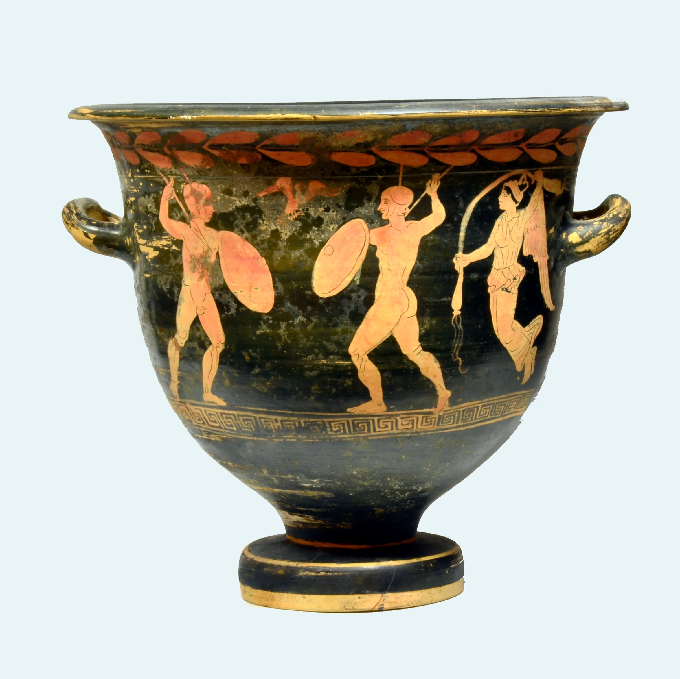
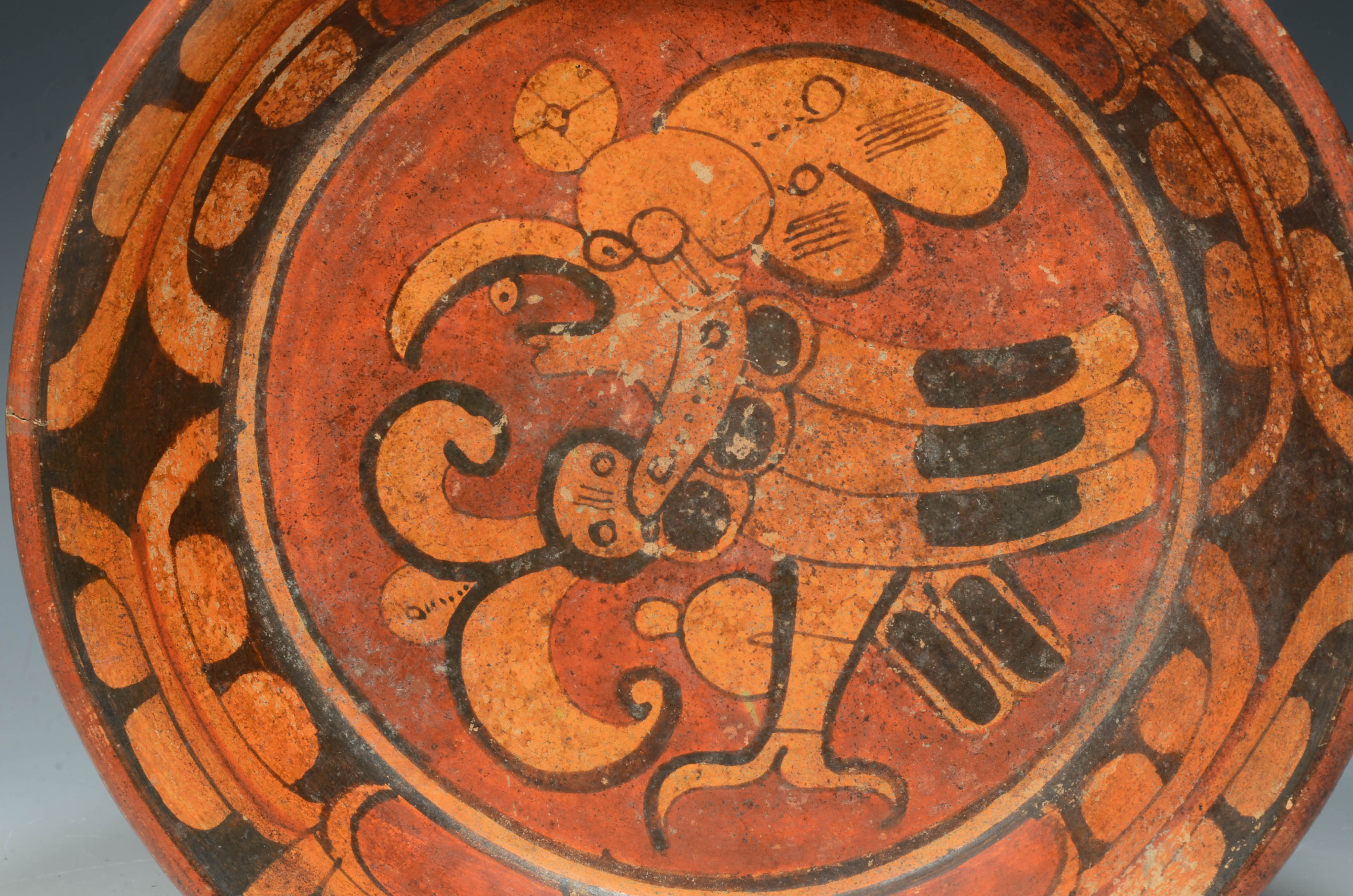
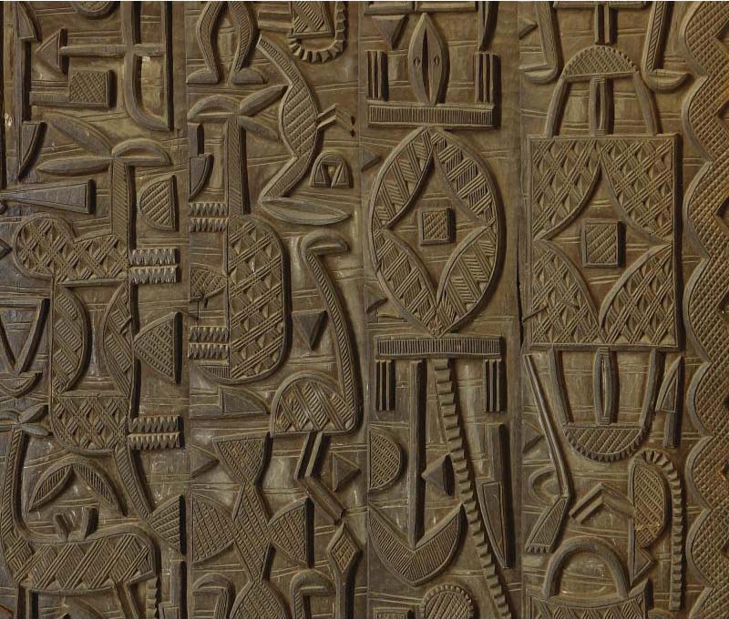
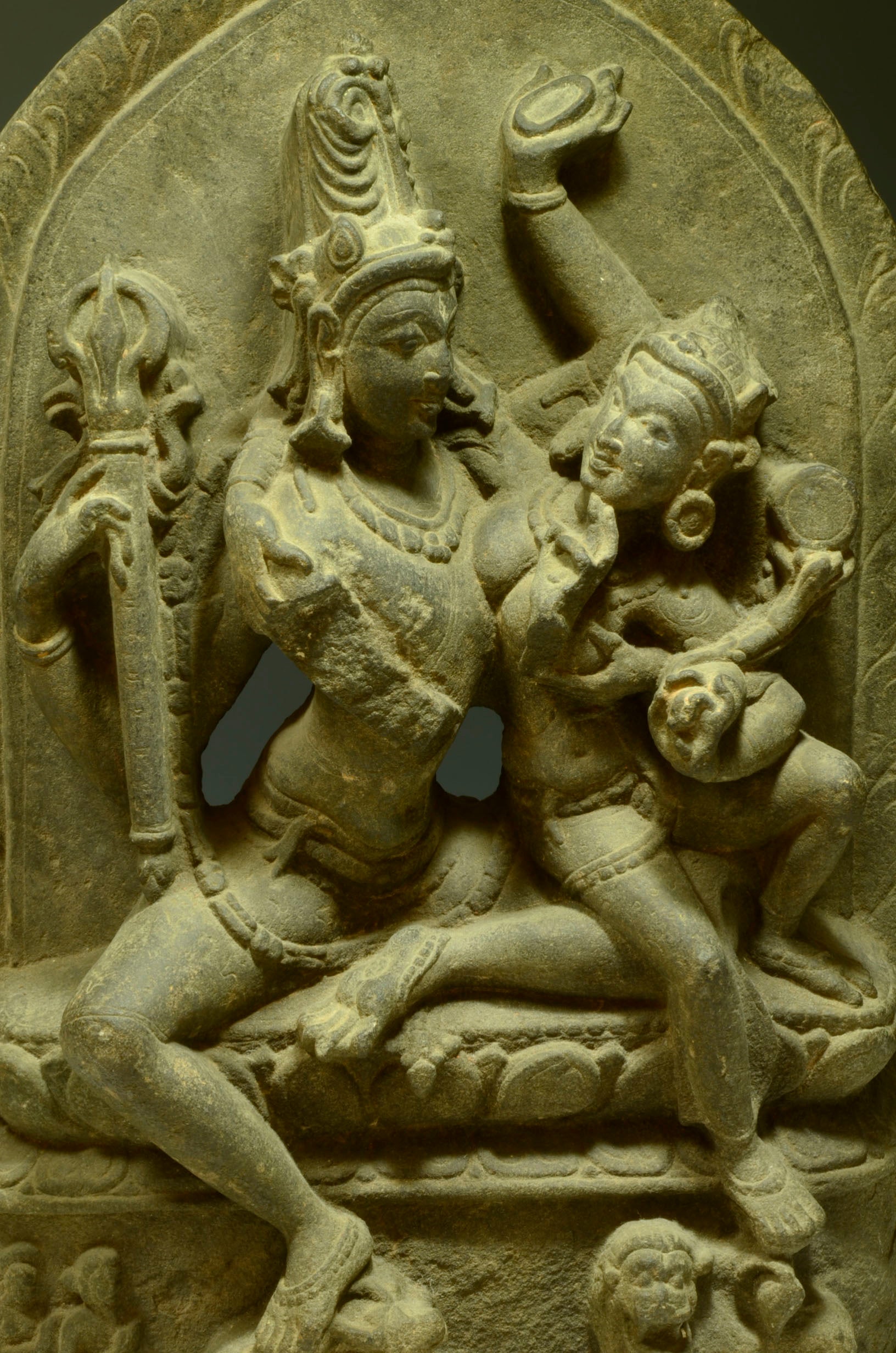
The serpent is also represented in pre-Columbian, Asian and ethnographic art, having symbolic meaning across cultures.
The ouroboros is often interpreted as a symbol for eternal cyclic renewal of life, death and rebirth; the snake shedding its skin is symbolic for rebirth and renewal and the snake biting its own tail is a fertility symbol in some religions.
The designer’s progression at work:


Art for Eternity will always be in Leah's debt for such a meaningful and impactful logo. I consider it a stroke of genius!